🛠️ PS: This article was written using generative AI—prompted…and re-prompted, refined, and reviewed by our team. We believe in showing—not just telling—how AI fits into real work. Em Dashes optional.

Building a Website with AI: The Showdown That Turned Into a Team-Up
Written by Erica Carrasco, Product Designer / Sr. Technical Writer and Dusan Momcilovic, Full Stack Developer
—and AI
What started as a lighthearted faceoff between a UX Designer and a Developer quickly evolved into something much more valuable: collaboration. We set out to test AI-powered web development tools—pitting Figma Sites against Replit—to see which could bring our website vision to life faster and cleaner within a tight two-week sprint. But as we dove into the sprint, we realized the true advantage wasn’t the tech. It was the back-and-forth, the shared problem-solving, and the unexpected ways our skill sets overlapped. In the end, the winning tool didn’t come from AI—it came from us working together.
When you’re building an MVP (minimum viable product), speed matters — but so does the user experience. For a new marketing website, our goal was to bring our Figma design to life quickly without compromising usability, especially on mobile devices. What we ended up with was a crash course in the current state of low-code tools, and a solid MVP site that’s now live at checkinandout.com.
We also wanted to share the story behind how we got here, because we learned a lot and we think other teams navigating AI-assisted or low-code development will relate.
The First Trial: A Replit-Only Quest
The original assignment? Build a CIAO marketing website using Replit—only Replit. No Webflow. No WordPress. Just Replit and whatever AI assistance it could offer.
As the UX Designer, Erica jumped in first, but the early results were underwhelming. Replit’s AI wasn’t responding to layout or design prompts in meaningful ways. The generated code worked, but visually, it missed the mark. It was functional… but boring. So Erica pivoted to Figma to create the design she actually wanted—and when she imported that design into Replit, the results completely fell apart, even after trying the new Replit/Figma importer recently announced.
That’s when Dusan, our developer, joined the effort. While he began working to rebuild Erica’s Figma layout in Replit manually, Erica explored an entirely different path: Figma Sites.
The Clash of Magic and Logic: Design Fidelity vs. Functionality
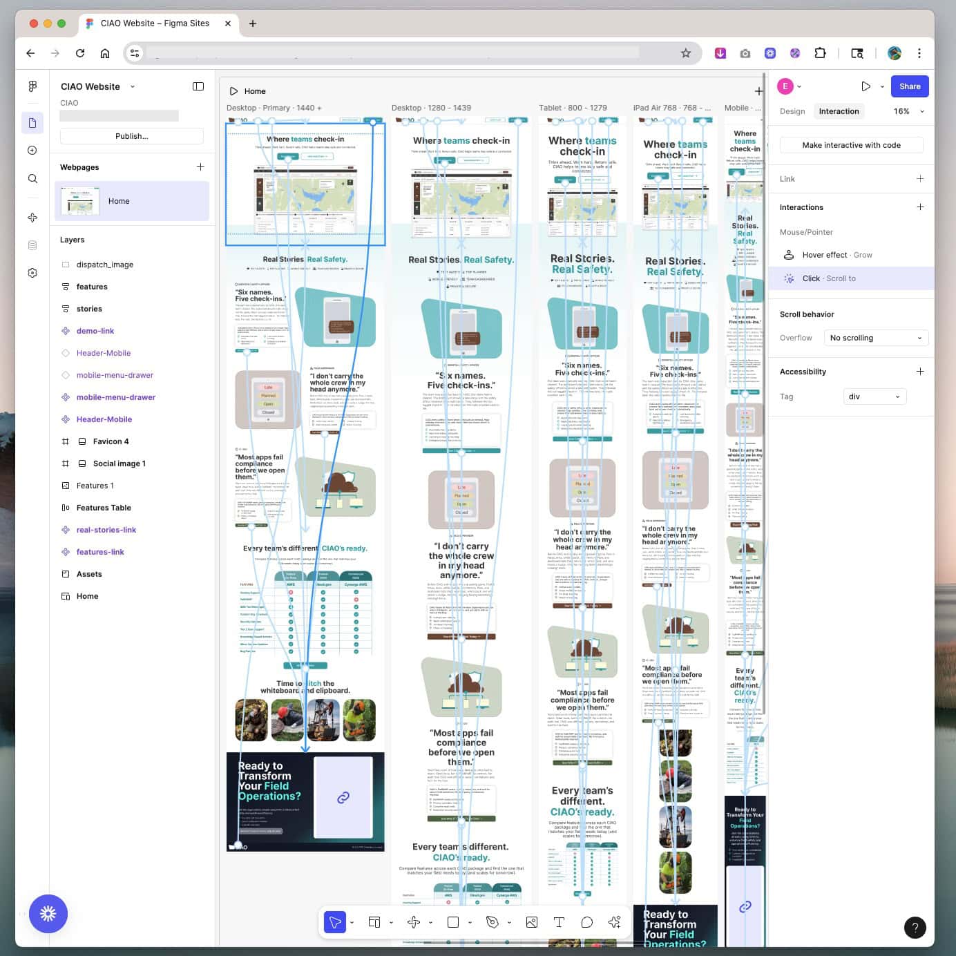
Our initial build using Figma Sites felt like sorcery in the best way. This new feature translates Figma designs directly into functional websites, and the visual fidelity was almost too good to be true. It didn’t just match the layout pixel-for-pixel—it added buttery-smooth micro animations and even auto-generated a sticky header using its built-in AI. From a designer’s perspective? Honestly, magical.
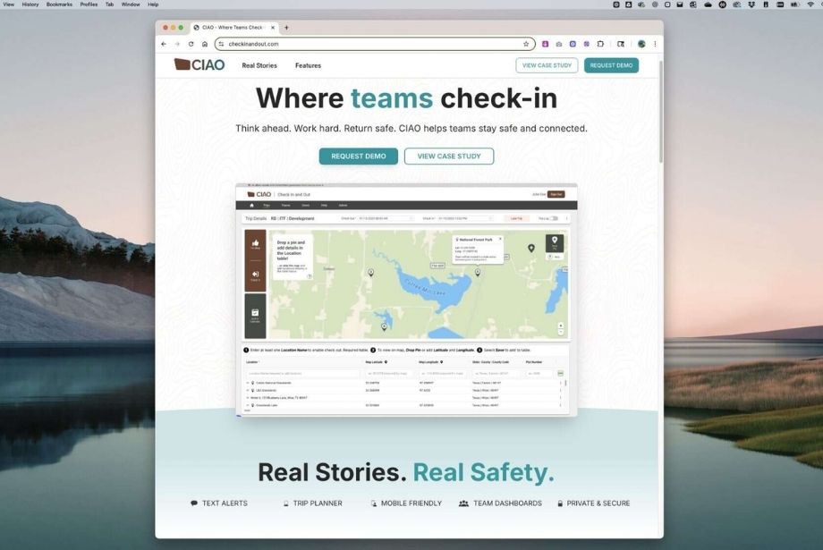
Once we saw the site running in Figma’s demo mode, we were all in. It looked shippable, and for a brief, glorious moment—it was. In Chrome, the published site looked and behaved beautifully. The animations were fluid, the design was intact, and it felt like we’d fast-tracked our way through a sprint.

CIAO Marketing Website in Figma Sites
This design was exported from a Figma design file into Figma Sites.
Of course, reality set in when we started cross-browser testing—but even then, Figma Sites had already proven its potential. It set the visual bar high, and the dev side had a solid reference to work from moving forward.
But then came the catch:
Sticky headers don’t play well on iOS mobile or desktop Safari. And when your audience is likely checking out your site from the field or on the go, mobile navigation has to work with no exceptions. A bit of digging revealed it’s a known issue with no clear fix just yet. (See more on Figma’s forum.)
The Turning Point: Allies in the Code War
Luckily, we had a Plan B. Dusan had already started recreating the design in Replit, using the original Figma file as a visual guide. Once we decided to pivot, he handed it off to Erica for final polish and styling tweaks.
Dusan’s no stranger to Replit—he’s used it for building apps and websites before and is super comfortable navigating the environment. But this was his first time working directly with a Figma design file, and the first time partnering with a designer to build a site in Replit. Before this project, he typically used Replit’s default templates and color tools, which he thought were solid and even a little underrated. But bringing in a detailed Figma design changed the game.
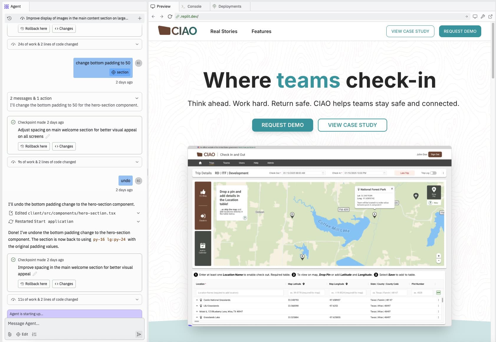
As he dug into the file, he found himself working section by section, side-by-side with the Figma design open in one window and Replit in the other. Uploading the full Figma file into Replit seemed promising, but it didn’t translate cleanly. The layout was rough, the icons and badges didn’t carry over, and the color scheme was way off. So Dusan rebuilt the page section by section: header, hero, story cards, image gallery, CTA, and footer. It wasn’t drag-and-drop, but with a clean design to follow and his Replit experience, he got the full page up in just 4–6 hours. Compared to the one or two full sprints it would’ve taken using our current codebase and design system, that’s a huge win. Replit gave us just enough flexibility to move fast and get it right—no shortcuts, just smart ones.

CIAO Marketing Website in Replit
Built using the existing Figma design file and ideas from the Figma Sites iteration.
Since deploying the site in early July 2025, we’ve continued to make iterative improvements. We’ve been fine-tuning image display on mobile, improving responsiveness, and adding finishing touches like a social media sharing graphic. We’re still working through an issue with the alignment of the three image cards below the hero section—they’re not quite lining up as expected. Dusan and Erica plan to dig into the code to figure out what’s going on and keep refining as needed, as well as reviewing the site from an accessibility standpoint. They want to ensure it’s compliant with WCAG 2.1 AA standards.
That said, if Figma Sites fixes their sticky header issue, we’d seriously consider switching back for a future version of this static marketing site. The visual quality and smooth micro animations are hard to beat.
Post-Battle Debrief
1. Replit Needs a Co-Pilot
Erica tried using Replit on her own early in the process. The results? Not great. (Think: plain yogurt vibes. Respectfully.) Things really went off the rails after uploading a full PNG of the Figma file for replication. Replit didn’t handle it well—rendering issues, broken layouts, and a cascade of errors followed. It’s not quite ready for that kind of input… yet.
Around that time, Replit had just announced a new Figma importer, which sounded promising. Erica gave it multiple tries but was never able to get it to successfully import the design. It failed each time, and as of writing this post, still doesn’t work reliably on her end.
That’s where Dusan stepped in. From a developer’s perspective, Replit isn’t optimized for visual-first workflows, but when treated as a code environment with some AI assist, it’s workable. By breaking down the Figma layout into smaller components and manually guiding Replit through each section, he was able to rebuild the structure with cleaner output. While it lacked some of the polish of the Figma Sites version, it was functional, responsive, and cross-browser stable—everything we needed for the MVP.
2. Figma Sites Is Brilliant — But Not Quite Ready
From Erica’s perspective as the designer on this project, Figma Sites felt like working in a dream—full visual fidelity, animation support, and a near-interactive prototype feel. It was exciting to see a design so accurately translated into a functioning website with so little effort. Plus, it’s free if you’re already on a Figma Pro plan, with features like custom domains and multiple live sites depending on your tier.
That said, it’s still early days. Beyond the sticky header bug, there were other limitations like the lack of support for repeating backgrounds when we first started building. Not a dealbreaker, but definitely something to flag.
Still, Erica’s takeaway? Figma Sites has serious potential. For solo designers or lean teams who need to move fast without compromising visual quality, it could be a game-changer once some key limitations are addressed.
It’s also worth noting that Figma Sites is best suited for simple marketing pages, portfolios, or landing pages, not full web applications. While the visual fidelity is impressive, it doesn’t yet support the level of dynamic functionality or interactive logic needed for more complex user experiences. For showcasing a product like CIAO, it worked up to a point. But teams building anything beyond static content will likely hit limitations quickly.
3. Prompting Is Becoming a UX Skill
Whether you’re using AI tools for design or development, writing clear, specific prompts is quickly becoming a practical skill for UX professionals. We found ourselves iterating on prompts almost as much as we did on visuals—tuning language, structure, and context to get usable results. It’s not replacing design thinking, but it’s becoming a new layer of how we interact with tools to get to better outcomes, faster.
The End of This Campaign (For Now)
The MVP site for CIAO is now live and functioning across platforms. Is it perfect? Not yet. But that’s the beauty of an MVP — it gives us something to test, refine, and grow from. And while AI-powered site builders are getting smarter, human collaboration still leads the way. Replit needed Dusan’s logic, Erica’s design eye, and a lot of strategic hand-holding to get across the finish line. Stay tuned as we continue refining the CIAO marketing site — and exploring new ways to blend design, AI, and code to build smarter, faster, and better.
About the Authors

Erica Carrasco
Erica Carrasco helps write the words and designs the experiences that make Cynerge’s tech make sense. Equal parts strategist and storyteller, she’s passionate about turning complex ideas into something people actually understand.

Dusan Momcilovic
Dusan Momcilovic builds what companies and organizations can only imagine. As a Front-End Developer at Cynerge, he transforms ideas into fast, intuitive, and reliable user experiences that look as good as they perform.


